Unmasking Dark Patterns: Digital Privacy Tactics 2025

Websites frequently employ ‘dark patterns’ to manipulate user decisions, often leading to unwitting compromises of personal data and digital privacy in 2025.
In an increasingly interconnected world, where our lives are largely conducted online, safeguarding our digital privacy has become paramount. Yet, lurking beneath the surface of many websites are manipulative design choices, known as dark patterns, engineered to trick users into making decisions they might not otherwise. This article delves into six common tactics websites employ to compromise your digital privacy in 2025, offering insider knowledge and practical solutions to empower you.
Understanding the Subtle Art of Dark Patterns
Dark patterns are user interface designs that intentionally mislead or trick users into doing things they might not want to do, often to benefit the company. These tactics exploit cognitive biases and human psychology, making it difficult for individuals to maintain control over their personal data. Recognising these patterns is the first step towards defending your digital privacy.
The landscape of online interaction is constantly evolving, and with it, the sophistication of these deceptive designs. What might have been a straightforward choice a few years ago can now be shrouded in ambiguity, leading users down a path of unintentional data sharing or subscription enrolment. It is crucial for users to remain vigilant and informed about these practices.
The Psychological Underpinnings
Dark patterns often leverage psychological principles suchess as cognitive load, choice overload, and framing effects. By presenting information in a particular way, designers can nudge users towards specific actions, even if those actions are not in the user’s best interest. This can range from making privacy-invasive options easier to select to obscuring the path to opt-out.
- Cognitive Load: Overwhelming users with too much information or complex choices.
- Choice Overload: Presenting an excessive number of options, leading to decision fatigue.
- Framing Effects: Presenting choices in a way that influences perception, often highlighting benefits while downplaying risks.
Ultimately, understanding the subtle art of dark patterns is about recognising when a website is trying to guide your behaviour through design rather than transparent choice. Awareness empowers users to make more informed decisions about their digital footprint and privacy settings.
Forced Enrolment and Unwanted Subscriptions
One of the most insidious dark patterns involves forcing users into subscriptions or services they did not explicitly choose. This often occurs during registration processes or when completing a purchase, where an opt-out option is deliberately hidden or made difficult to find. Users might unknowingly agree to recurring charges or data-sharing agreements.
Imagine signing up for a free trial, only to find yourself automatically enrolled in a paid subscription if you forget to cancel. This is a classic example of forced enrolment. The website relies on user oversight and the inconvenience of cancelling to retain subscribers, often burying the cancellation instructions deep within their terms and conditions.
Another variant includes pre-ticked boxes for promotional emails or third-party data sharing. While seemingly innocuous, these pre-selected options can lead to a deluge of unwanted communications and the dissemination of personal information beyond a user’s initial intent. It shifts the burden of action from opting-in to opting-out, a subtle yet powerful manipulation.
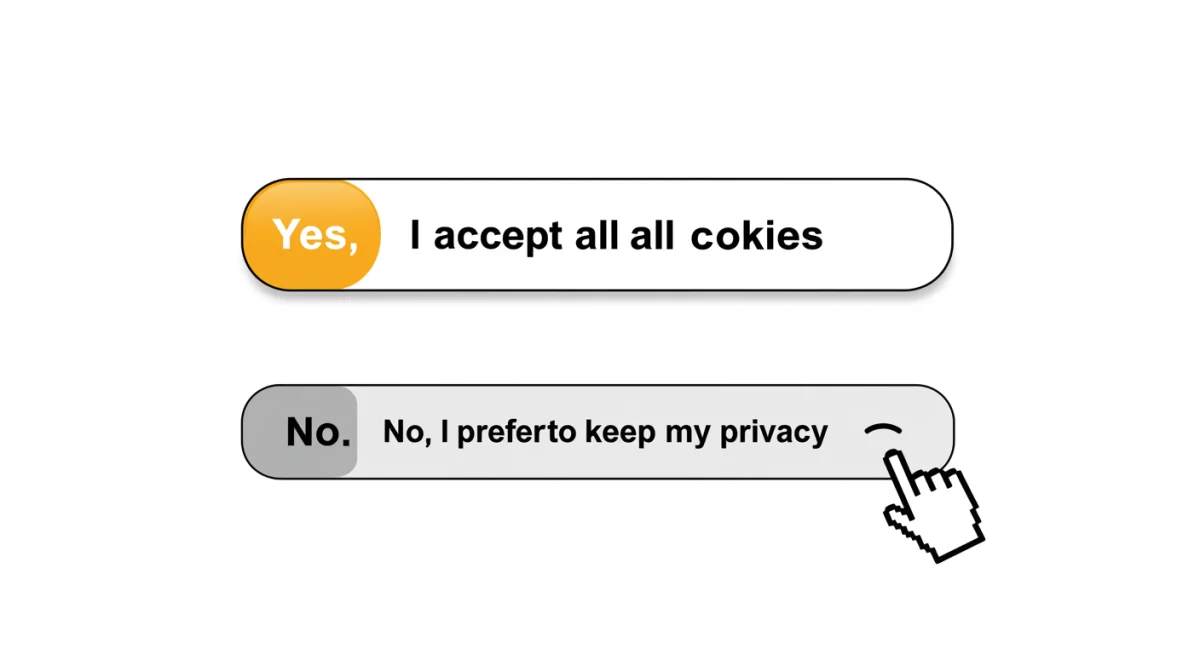
The Illusion of Choice: Confirmshaming
Confirmshaming is a dark pattern that guilt-trips users into opting into something they would otherwise decline. It presents choices in a way that makes one option seem morally superior or socially acceptable, while the alternative is framed negatively. This tactic preys on users’ desire to avoid feeling bad or being judged.
A common scenario involves pop-ups asking users to subscribe to a newsletter. The options might be presented as: ‘Yes, I want to stay informed and get exclusive offers!’ versus ‘No, I prefer to miss out on valuable updates.’ The latter option is designed to evoke a sense of regret or shame, pushing users towards the ‘positive’ choice.
Emotional Manipulation in Design
This pattern is particularly effective because it taps into our emotional responses rather than rational decision-making. By making users feel guilty or like they are making a poor choice, websites increase the likelihood of compliance. It’s a subtle form of emotional manipulation that bypasses critical thinking.
- Guilt-Inducing Language: Phrasing options to make users feel bad for declining.
- Social Pressure: Implying that declining an offer is an uncommon or undesirable action.
- Negative Framing: Presenting the opt-out option in a derogatory or dismissive manner.
Recognising confirmshaming requires a conscious effort to detach from the emotional framing and focus solely on the actual choice being presented. By doing so, users can make decisions based on their true preferences, not on manufactured guilt.
Privacy Zuckering: Hidden Privacy Settings
Named after Facebook’s CEO, ‘Privacy Zuckering’ refers to the dark pattern where users are tricked into sharing more information about themselves than they intended. This is often achieved by making privacy settings incredibly complex, difficult to find, or by setting default options to the least private configuration.
When setting up a new account or using a new service, users are frequently presented with a ‘quick setup’ or ‘recommended settings’ option. These often default to public visibility or extensive data sharing. To truly protect one’s privacy, users must navigate through convoluted menus and obscure settings, a task many find daunting or simply overlook.
The goal is to maximise data collection by making the path of least resistance lead to maximum data exposure. Companies benefit from this increased data, which can then be used for targeted advertising, analytics, or even sold to third parties. The burden is entirely on the user to opt-out, and the design makes this process intentionally arduous.
To combat Privacy Zuckering, users must adopt a proactive approach, meticulously reviewing all privacy settings and customising them to their preferences, rather than accepting default configurations. This often requires investing time and effort to understand the implications of each setting.
Misdirection and Hidden Costs: Bait and Switch Tactics
Bait and switch is a deceptive tactic where a user is led to believe they are making a certain choice or getting a specific deal, only to find out later that the offer has changed or there are hidden costs involved. This dark pattern is particularly prevalent in e-commerce and subscription services.
For instance, a website might advertise a product at an incredibly low price, only for the user to discover during checkout that the item is out of stock, or that the attractive price only applies to a different, less desirable version. They are then steered towards a more expensive alternative, having already invested time and effort in the purchase process.
Unveiling Deceptive Pricing
Another common form of bait and switch involves pricing. A service might be advertised as ‘free’ or ‘low cost,’ but upon signing up, users find themselves hit with unexpected fees, mandatory add-ons, or a significantly higher price for the features they actually need. The initial offer serves as a ‘bait’ to draw users in, and the ‘switch’ occurs when the true cost is revealed.
- Hidden Fees: Unexpected charges added at the final stage of a transaction.
- Unavailable Products: Advertising an item that is out of stock to promote alternatives.
- Feature Downgrading: Promising a full-featured service, then offering a limited version.
To avoid bait and switch tactics, always read the fine print, scrutinise pricing details, and be wary of offers that seem too good to be true. Taking the time to verify details before committing can save both money and frustration.
Urgency and Scarcity: The Fear of Missing Out
Creating a false sense of urgency or scarcity is a powerful dark pattern designed to pressure users into making quick decisions without proper consideration. Websites use countdown timers, ‘only X left in stock’ notifications, and ‘deal ends soon’ banners to trigger the fear of missing out (FOMO).
This tactic is widely used in online retail and travel booking sites. You might see a message like ‘Only 2 rooms left at this price!’ or ‘This offer expires in 15 minutes!’ These notifications aim to bypass rational thought, prompting impulsive purchases before users have a chance to compare prices or reconsider their needs.
While genuine urgency can exist, many websites fabricate or exaggerate it to boost sales. The psychological impact is significant: users fear regretting a missed opportunity, leading them to act quickly, often against their better judgment. This can result in unnecessary purchases or commitments that they later regret.
To counter urgency and scarcity tactics, cultivate a habit of pausing before making a purchase or commitment. Take a moment to verify the claims, search for similar deals elsewhere, and assess whether the urgency is genuine or merely a manipulative design element. Rationality is your best defence against FOMO-driven decisions.
Nagging and Interruptions: Persistent Prompts
Nagging and interruptions refer to the incessant prompts, pop-ups, and notifications that disrupt a user’s experience, often pushing them to perform an action they have previously declined or ignored. This dark pattern aims to wear down user resistance through sheer persistence.
Think about the constant cookie consent banners that reappear even after you’ve made a choice, or the endless requests to sign up for a newsletter every time you visit a site. These interruptions are designed to be annoying enough that users eventually give in, simply to make them stop. The company benefits by gaining data or subscriptions, while the user’s experience is degraded.
The Wear-Down Effect
The effectiveness of nagging lies in the ‘wear-down effect.’ By repeatedly presenting the same request, often in slightly different formats or at different points in the user journey, websites capitalise on user fatigue. Eventually, users may click ‘accept’ or ‘OK’ not because they genuinely agree, but to regain control of their browsing experience.
- Repetitive Pop-ups: Asking for the same action multiple times.
- Dismissal Difficulty: Making it hard to close or ignore prompts.
- Obscured Content: Placing prompts over essential content, forcing interaction.
To combat nagging, look for clear ‘no thanks’ or ‘dismiss’ options, and consider using browser extensions that block unwanted pop-ups. While some interruptions are unavoidable, persistent nagging is a clear sign of manipulative design intended to erode your digital privacy.
| Dark Pattern | Brief Description |
|---|---|
| Forced Enrolment | Users are unknowingly signed up for services or subscriptions. |
| Confirmshaming | Guilt-tripping users into opting for privacy-invasive options. |
| Privacy Zuckering | Tricking users into sharing more data than intended via complex settings. |
| Urgency/Scarcity | Pressuring users into quick decisions with false time limits. |
Frequently Asked Questions About Digital Privacy and Dark Patterns
Dark patterns are user interface design choices that intentionally mislead, trick, or manipulate users into making decisions that are not in their best interest, often compromising their digital privacy or leading to unwanted subscriptions. They exploit psychological biases to influence behaviour.
Look for intentionally confusing language, pre-ticked boxes, hidden opt-out buttons, overwhelming choices, or emotionally manipulative phrasing. If a decision feels forced or unclear, it might be a dark pattern. Always scrutinise options carefully before proceeding.
While not always explicitly illegal, many dark patterns fall under existing consumer protection laws and data privacy regulations like GDPR. Regulators are increasingly scrutinising and taking action against designs that violate transparency and fair practice principles. Enforcement is growing.
Always read terms and conditions, uncheck pre-ticked boxes, choose custom privacy settings over default recommendations, and take your time before clicking ‘agree’ or ‘buy’. Use privacy-focused browsers and extensions to enhance your protection.
Unfortunately, as data becomes more valuable, the incentive for companies to use dark patterns may increase. However, growing public awareness and stronger regulatory actions are likely to push for greater transparency and ethical design practices in the future.
Conclusion
The digital landscape of 2025 demands a heightened awareness of the subtle, yet powerful, tactics websites employ to influence our decisions and compromise our digital privacy. By understanding dark patterns like forced enrolment, confirmshaming, privacy Zuckering, bait and switch, urgency, and nagging, users can equip themselves with the knowledge to navigate the online world more securely. Proactive engagement with privacy settings, critical evaluation of choices, and a healthy dose of scepticism are your strongest allies in safeguarding your personal information against these deceptive designs.


